

This summer, we got to explore Hierarchical Navigable Small World (HNSW) a foreign concept for us both. We’ll take you on the journey we went through by asking the questions we asked ourselves, and answering them to the best of our abilities with the knowledge we gained. We also include a TL;DR at the bottom for those who’d like the short version.
What is a Hierarchical Navigable Small World?
HNSW is an algorithm used for Approximate Nearest Neighbor (ANN) search in large vector databases, such as embeddings of text, images, or audio. It’s used in search engines, recommendation systems, and similarity detection. Unlike brute-force search, which calculates the distance between your query vector and every other vector in the dataset, HNSW builds a multi-layer graph structure that lets you quickly zoom in on the most relevant results and get the approximate nearest neighbors, usually at a fraction of the original runtime.
HNSW organizes data into a hierarchy of proximity graphs. The top layers are sparser, containing fewer nodes, and are used for coarse, fast traversals. The lower layers contain more nodes for finer-grained search, with only the bottom layer guaranteed to contain every document. The search starts at the top layer from a single entry point, greedily moves toward closer nodes, and descends through the layers when no closer node can be found from the current node. In the bottom layer, instead of just one approximate nearest neighbor, the search maintains a list of the top-k nearest neighbors, which is continuously improved during the search and eventually returned to the user.
HNSW can be conceptually difficult to grasp. A visual representation would be incredibly helpful, showing the path the algorithm takes, which nodes are visited in each layer, whether the closest node to the query in a given layer was reached or missed, and giving a general overview of what’s going on. It may also help by quantifying how far off the chosen node was from the actual best in a layer if nodes are placed based on distance. This visualization is exactly one of the tools we created!
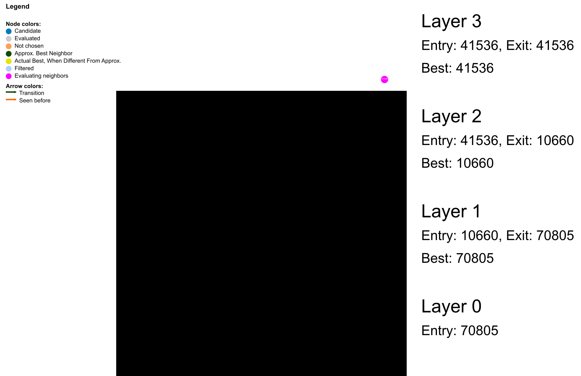
Here you can see the algorithm traversing the graph, descending a layer when it cannot find a closer node in the current layer. The last layer has more “best nodes”, as that is when we want to start a k-nearest neighbors search. Some nodes have been discovered before, but for the most part, we find new nodes to compare against the found nearest neighbors. The nodes usually do not have the same neighbors in different layers. Did you find it easier to look at an animation? If so, we did a great job!
How do you build the HNSW graph?
The graph is built incrementally as documents are added, using the same algorithms that are used during search to determine which neighbors the node should have:
- We start with an empty graph.
- For each new data point, a maximum layer is assigned using a probabilistic method (e.g., geometric distribution). This ensures fewer nodes in higher layers, creating a sparser representation at the top.
- The new node is inserted into all layers up to its assigned maximum layer. It is connected to the rest of the graph by inserting edges to its approximate nearest neighbor, which we find using the search algorithm.
Here is a video of a tiny, tiny part of the process:
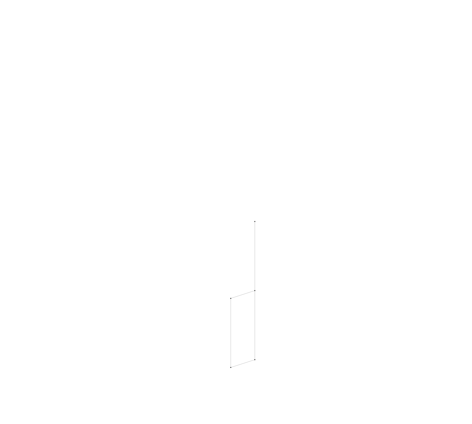
Remember, a 2D representation of proximity is generally not great for intuition of embeddings. We specifically chose a dataset with only two dimensions to make this easier to grasp.
A vector space of embeddings usually consists of hundreds of dimensions, and projecting the graph to 2D is simply not meaningful, but it does look kind of cool. Here is a video of structuring another dataset into a graph, one you are more likely to meet when dealing with vector embeddings. See how it looks like it’s choosing random nodes as neighbors? We’ll come back to dimensionality reduction.

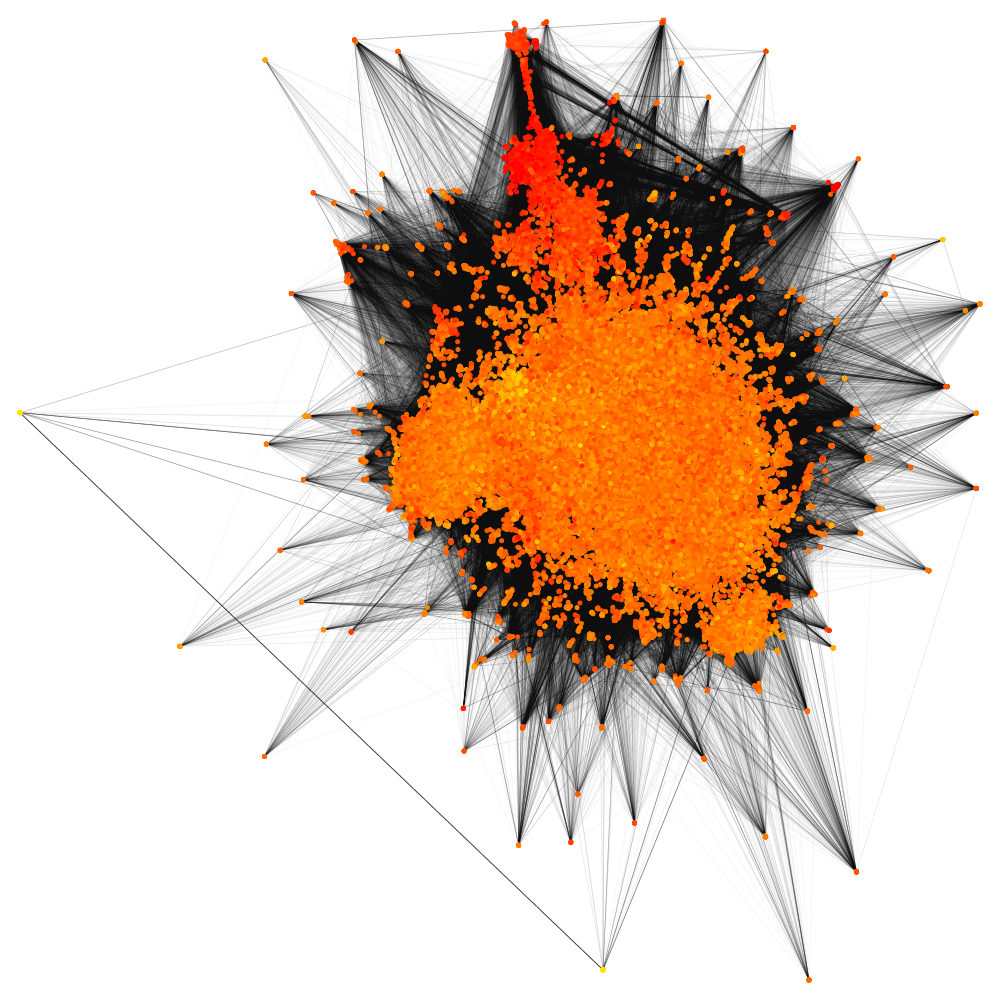
What does the HNSW graph look like when it’s finished building?
Like this:
But with its millions of documents, hundreds of vector dimensions and high interconnectivity, it’s hard to glean any insight from an image alone. We therefore resort to other methods of “viewing” the graph by taking a look at some of the graph’s qualities.
What do you mean, “graph qualities”?
Properties like connectedness, edge density, and neighbor proximities affect the quality of the search results when traversing the graph - these are areas we explore below.
The graph should be connected. If a node or cluster is disconnected from the main cluster you’ll never reach it, as the search physically cannot reach nodes that do not have a path to them. This means nodes could be completely invisible to a search, and as the searching algorithms are also used to build the graph, no future connections will be made to these unreachable nodes. These documents could be deleted and reinserted to become accessible again, or one could try to come up with a heuristic to reconnect them to the graph.

The documents that are part of these disconnected components will never be found in an ANN search using HNSW, they would only be found using an exact search. This tool is super helpful, as using ANN to try to find these invisible documents would be like finding a needle in a haystack, with the needle actually being in a different haystack we are not even considering! Kind of. So getting a list of nodes you know need reinsertion or reconnection is helpful to make the documents visible to the search again.
A histogram of edge density, or neighbor counts per node, in a layer helps reveal how densely connected this layer is. If it is too sparse, you might be missing parts of the graph closer to the query, as you are comparing your findings to a small number of potentially better candidates. If it is too dense, performance may suffer as you have to check many nodes for each step in the graph, converging towards exact search. We used a library to plot an edge density histogram in the terminal.

Edge density by itself does not give a lot of information about the graph, but it could be helpful to find bugs! For instance, inserting 100,000 documents and deleting 90% gave another distribution of edge density than just inserting 10,000 documents, even though the graphs have the same number of nodes!
For a sample of nodes, you can analyze their neighbor proximity, or more specifically, how close their neighbors in the graph are compared to the global distance distribution (e.g., if most are top 10%, bottom 30%). This helps detect potentially poorly connected nodes or biased neighborhoods. Listing these “badly” connected nodes gives both insight and could be used directly to figure out what nodes might be unreachable using the HNSW algorithm, even if not disconnected from the graph.
We created a tool to check if at least one neighbor is within the global best 15%, the best 2%, and the best 0.3%, to give an indication of which nodes might need to be reinserted into the graph.
Is HNSW a good choice for approximate nearest neighbor search?
We found the quality of an ANN search algorithm is often evaluated using three main metrics. The recall metric compares the retrieved neighbors to the exact nearest neighbors. The reason why HNSW doesn’t always give the same result as an exact search is that it can get stuck in a local minimum during the search. This happens when the search has found a set of nodes that doesn’t have any neighbors that are closer to the query vector and decide this set is the best, even though better nodes exist.
The other main metrics are response time and memory footprint of the data structure. HNSW scores very well on all of these metrics, which is why it’s considered a state of the art approximate nearest neighbor search and therefore chosen by Vespa.
While these metrics are the things we ultimately care about when analyzing the performance of a search, they don’t tell us a lot about what actually happens during a query execution. We took a deeper dive into the graph structure, query traces and the underlying vector data in hopes of finding more insight into HNSW, and maybe even the reason why it sometimes performs worse than expected.
A potentially more nuanced metric is the precision of the search, which measures how relevant the found approximate nearest neighbors are. Precision is typically defined as the fraction of retrieved neighbors that are relevant, while recall is the fraction of all relevant neighbors that are retrieved. In ANN search, high recall is usually prioritized, but precision can be useful for understanding the quality of the results. Even if not all of the top-k true neighbors are returned, if most of the returned neighbors are close to the query, the search is still effective for semantic tasks.
We can also compare the distances of nodes visited during the query to those from random sampling. If the query distances are significantly better than random, your search is likely effective at navigating the graph to find relevant data:
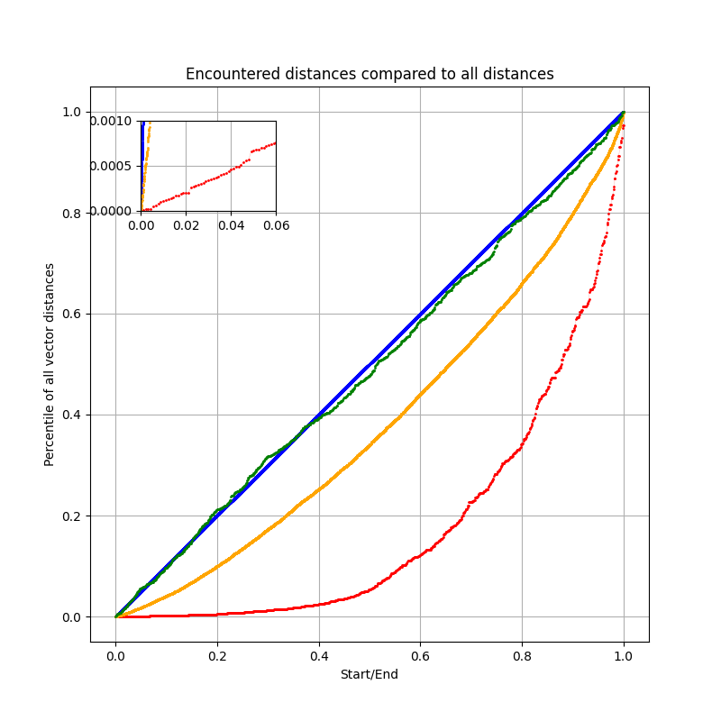
The plot compares the distance distributions of nodes encountered during different search strategies: HNSW (red), ACORN-1 (orange), random sampling (green), and exact search (blue).
We see that HNSW reaches nodes that are much closer to the query than average. With only ~600 visited nodes, about 40% of them fall within the closest 5% of all points in the dataset. This “exponential” curve shows that HNSW efficiently guides the search toward the nearest neighbors and evaluates more nodes closer to the query.
ACORN-1 (orange), a HNSW-based algorithm we’ll take a look at later, follows a similar trend but is evaluating a much larger number of nodes ~14k. This higher cost increases the chance of eventually reaching the exact best neighbors, but it is also evaluating more irrelevant nodes compared to HNSW, making it slower for most searches.
Random sampling (green) produces a distribution close to that of exact search (blue), but without any guarantee of converging to better nodes quickly. Random picks will often perform worse than structured methods like HNSW when the same number of nodes are evaluated, HNSW can make smart choices for nodes to evaluate, which random picking cannot.
You are dealing with so many dimensions in the vector space, could you hypothetically reduce them?
Yes, in some cases! Dimensionality reduction could help speed up searches. If you are lucky with your data (or more likely, unlucky with your embedding), the dimensionality reduction of data is lossless. In practice, dimensionality reduction techniques like Principal Component Analysis (PCA) are lossy, but can preserve most of the variance in the data for euclidean-based comparisons. The effectiveness depends on your embedding model, the distance metric used, and the nature of your data. If your use case can tolerate a bit of fuzziness in the results, this trade-off might be worth it for a decent speed-up. The following image is a scree plot which we use to determine how many dimensions carry most of the variance in the data for euclidean-based comparisons.
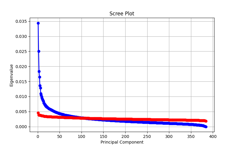
As you can see, there are dimensions that stand for <0,01% of the variance of the data. That is hardly any variance at all! Reducing the vector space here would allow a small bit of speed up in the distance calculations with minimal data loss.
An alternative to PCA is Matryoshka Representation Learning.
How does HNSW perform when a filter is applied?
While HNSW works well for finding the top-k nearest neighbors among all nodes, things can get more complicated when an additional filter is applied. There are multiple main approaches:
- Fallback to exact search
- Use post-filtering
- Use pre-filtering
- Use pre-filtering, but check the filter first
In post-filtering, the HNSW search is performed as without a filter, and the filter is only applied to the hits afterwards. This means that all returned hits may be filtered out and no hits are actually returned to the user, which is problematic.
In pre-filtering, the graph is explored as normal, and the filter is used to decide if a found node is returned to the user. The search doesn’t end until enough filter-passing nodes are found, so with heavy filtering a large portion of the graph may need to be searched.
In pre-filtering, when checking the filter first, only nodes that pass the filter are considered when navigating the graph. This avoids distance computations to nodes that do not pass the filter, but if only few nodes pass the filter, the chance of getting stuck while exploring the graph increases dramatically. This is why ACORN-1 expands the search to include neighbors of neighbors to avoid getting stuck when filtering is aggressive. In contrast, standard HNSW does not use multi-hop neighborhoods.
So, which method is best? It depends on the filtering percentage. When most nodes pass the filter, pre-filtering is fast and efficient. With more aggressive filtering, the response time of pre-filtering increases, while pre-filtering with checking the filter first can maintain high performance with reasonable recall. With very aggressive filtering, exact search may be required. The filtering fraction is therefore calculated beforehand to determine the searching algorithm used.
Did our tools actually do anything useful?
Yes! Our tools uncovered a subtle Vespa bug, the deletion code in layer 0 capped neighbors at max-links-per-node instead of 2*max-links-per-node, producing sparser graphs than intended. This was found with edge density analysis. We also found unexpected dimension reducible embeddings, some real-world datasets had dimensions with very little to no variance, offering small potential speed-ups. Our findings show the value of graph structure analysis beyond standard ANN metrics.
Our experience at Vespa.ai
We really enjoyed the challenge. It was fun to create something new together with someone you’ve never met before. We gained unique insights into search algorithms we’d never gotten otherwise, and it was rewarding when we finally got the tools working! We are thankful for the opportunity to contribute to and learn from the people here at Vespa!
TL;DR
We learned a lot about Approximate Nearest Neighbor (ANN) search and developed tools to help visualize and analyze ANN algorithms like HNSW and ACORN-1. We also developed tools to visualize characteristics of embedded data to assist with debugging and finding oddities in the HNSW graph and its data, such as disconnected components and unused vector dimensions. And we had a lot of fun!