
When something goes wrong in production, the hard part is rarely finding a metric. The hard part is figuring out which metric tells you where to look next.
The Vespa Cloud metrics dashboard is designed for exactly that. Instead of treating monitoring as a wall of graphs, it helps you move from symptom → bottleneck → action.
Start with three questions
Most production issues can be reduced to three questions:
- Is the system healthy?
- Where is latency added?
- Are we running out of resources?
The dashboard mirrors that flow.
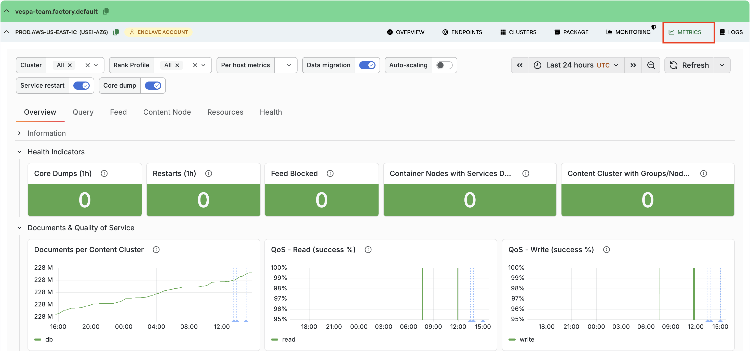
1. Is the system healthy?
Start on the Overview tab. This is the fastest place to answer “is anything obviously broken?”. A healthy system keeps read and write QoS close to 100%. If it drops, look at whether 4xx or 5xx responses are rising — 5xx responses usually mean the problem is on the server side. A rise in degraded or failed queries means it is time to continue into the Query tab.
See the docs for the full reference: Metrics Overview tab.
2. Where is latency added?
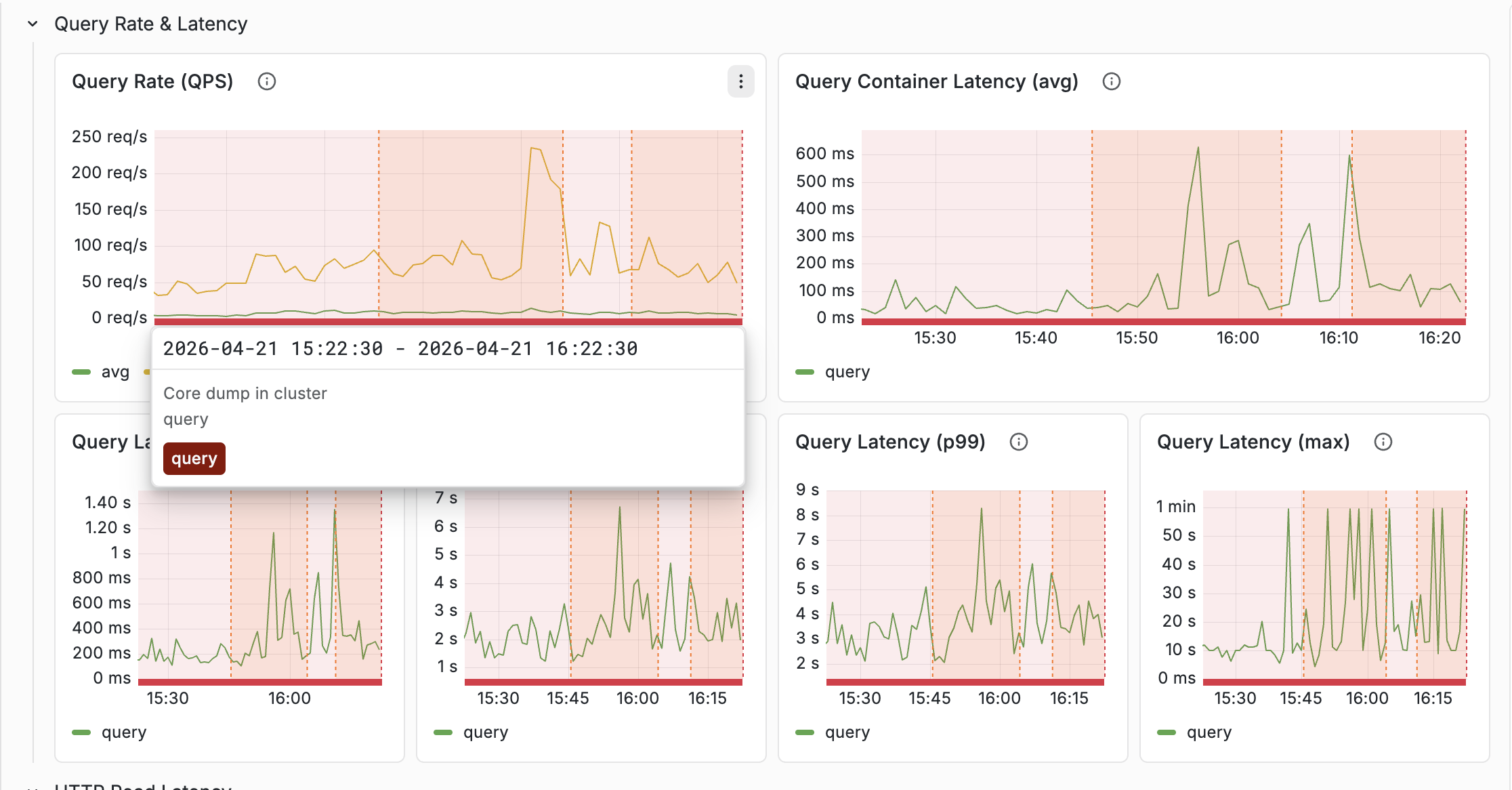
Latency in Vespa is layered — a slow request is not just “slow”, it can be slow in different parts of the path:
HTTP → container → content nodes → ranking
That is why the dashboard shows several latency metrics for what feels like the same request. If HTTP latency is much higher than query latency, payload size or network overhead may be the issue. If search-protocol latency on the content nodes is high, the bottleneck is deeper in the system.
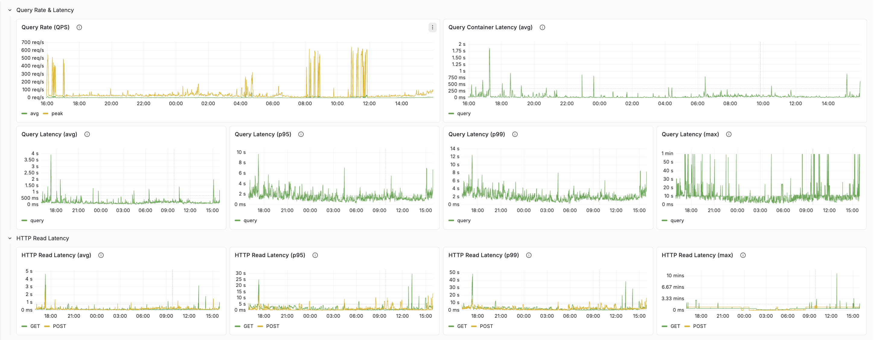
See the docs for a layer-by-layer walkthrough: Query tab and Feed tab.
3. Are we running out of resources?
Once you know where the slowdown is, switch to the Resources tab. As a rule of thumb, sustained utilization above roughly 80% is a sign the cluster may need more headroom. If one host is much hotter than the others, enable per-host metrics and look for uneven load distribution.
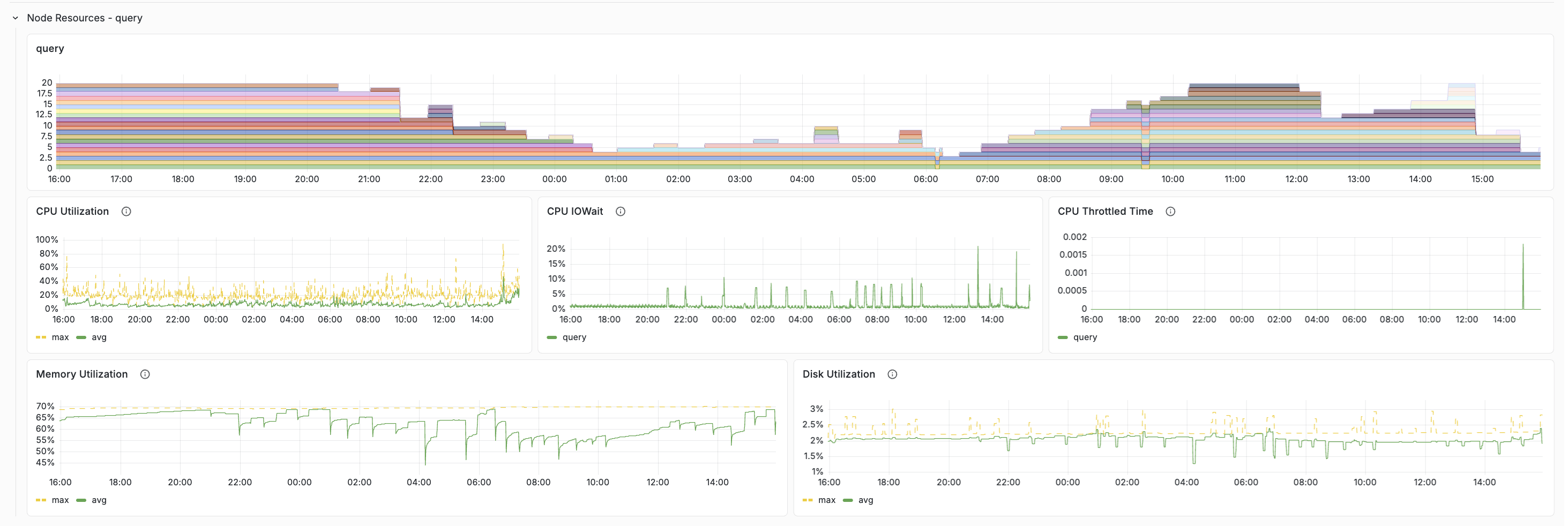
See the docs for healthy-value tables and scaling guidance: Resources tab.
What’s new in the latest revision
The dashboard has picked up a few improvements worth calling out.
Health Indicators on the Overview tab
The Overview tab now opens with a dedicated Health Indicators row — five stat panels that surface stability issues in a single glance: Core Dumps (1h), Restarts (1h), Feed Blocked, Content Cluster with Groups/Nodes Down, and Container Nodes with Services Down.
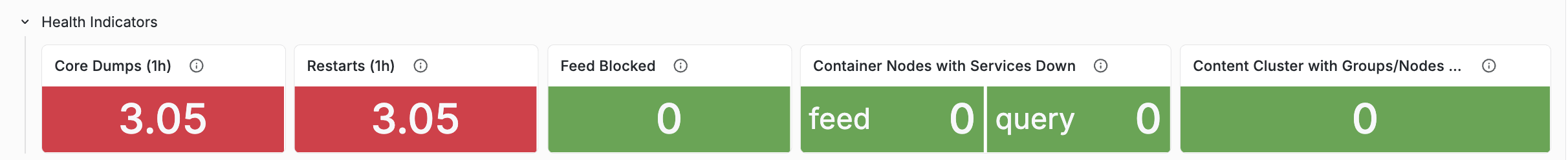
Details and healthy values: Health Indicators.
Annotations for Service restart and Core dump
Annotations are the vertical lines drawn across every chart when an operational event happens — Vespa upgrades, feed blocked, data migration, reindexing, autoscaling changes. Two annotations were added recently and they are worth flagging:
- Service restart — fires when a Vespa service process restarts. Outside of planned upgrades, restarts usually mean a crash, OOM, or forced stop.
- Core dump — fires when a process core-dumps. Should be extremely rare.
When a latency anomaly lines up with one of these annotations, you get the context for the change without having to infer it from the graph alone. Both signals also feed the Overview’s Health Indicators row, so the same event shows up in three places: the counter, the annotation line, and the Health tab’s historical time series.
Full annotation reference: Annotations.
Container thread pool rows, one per configuration case
The Resources tab used to have a single thread-pool row that was mostly empty —
a container only has the thread pools that match its services.xml configuration
(<search>, <document-api>, or both). The row has been split into three
case-specific rows:
- Thread Pools (search + document-api) for full-feature containers
- Thread Pools (search only) for query-only containers
- Thread Pools (document-api only) for feed-only containers
Classification is automatic — hidden variables derive the cluster list per case from Prometheus set operations, so only relevant rows render for a given deployment. Each thread pool now gets its own panel with avg (green) and max (yellow dashed) on the same chart.
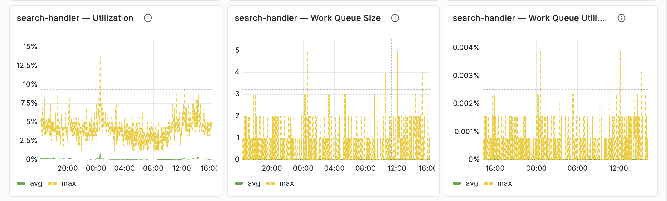
Details: Container Thread Pools.
JVM memory breakdown (heap / direct / native)
The Resources tab separates the three layers of container memory: heap, direct, and native. This matters on container nodes that run embedders or local LLM components — model weights are memory-mapped and partially resident, but KV cache and compute buffers are allocated upfront as native memory. When node memory is high but heap and direct look normal, the native layer is usually where to look.
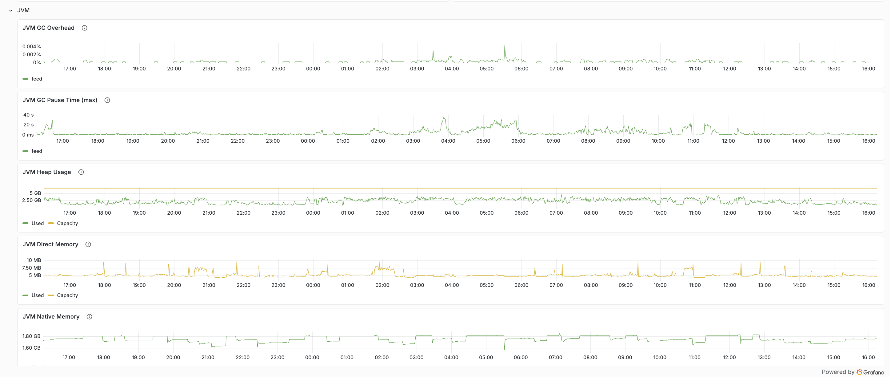
Details: JVM memory breakdown.
A simple workflow
A practical way to use the dashboard during an incident:
- Open Overview and scan the Health Indicators row.
- Confirm the symptom (QoS drop, latency spike, error-rate increase).
- Use Query or Feed to find the slow layer.
- Use Resources to confirm whether the cluster is saturated.
- Cross-reference annotations for restarts, upgrades, reindexing, or migration.
That flow gets from “latency is up” to “this is the actual bottleneck” much faster than scanning every chart. The common workflows section of the docs has recipes for the most frequent scenarios.
Summary
The Vespa Cloud metrics dashboard works best as a troubleshooting tool — not a metrics catalog. Start with health, follow the latency path, confirm with resources, and use annotations to connect spikes to real events. The tab reference, healthy-value tables, and step-by-step workflows live in the Monitoring documentation.